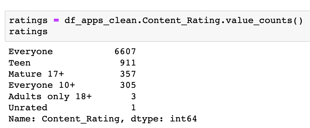
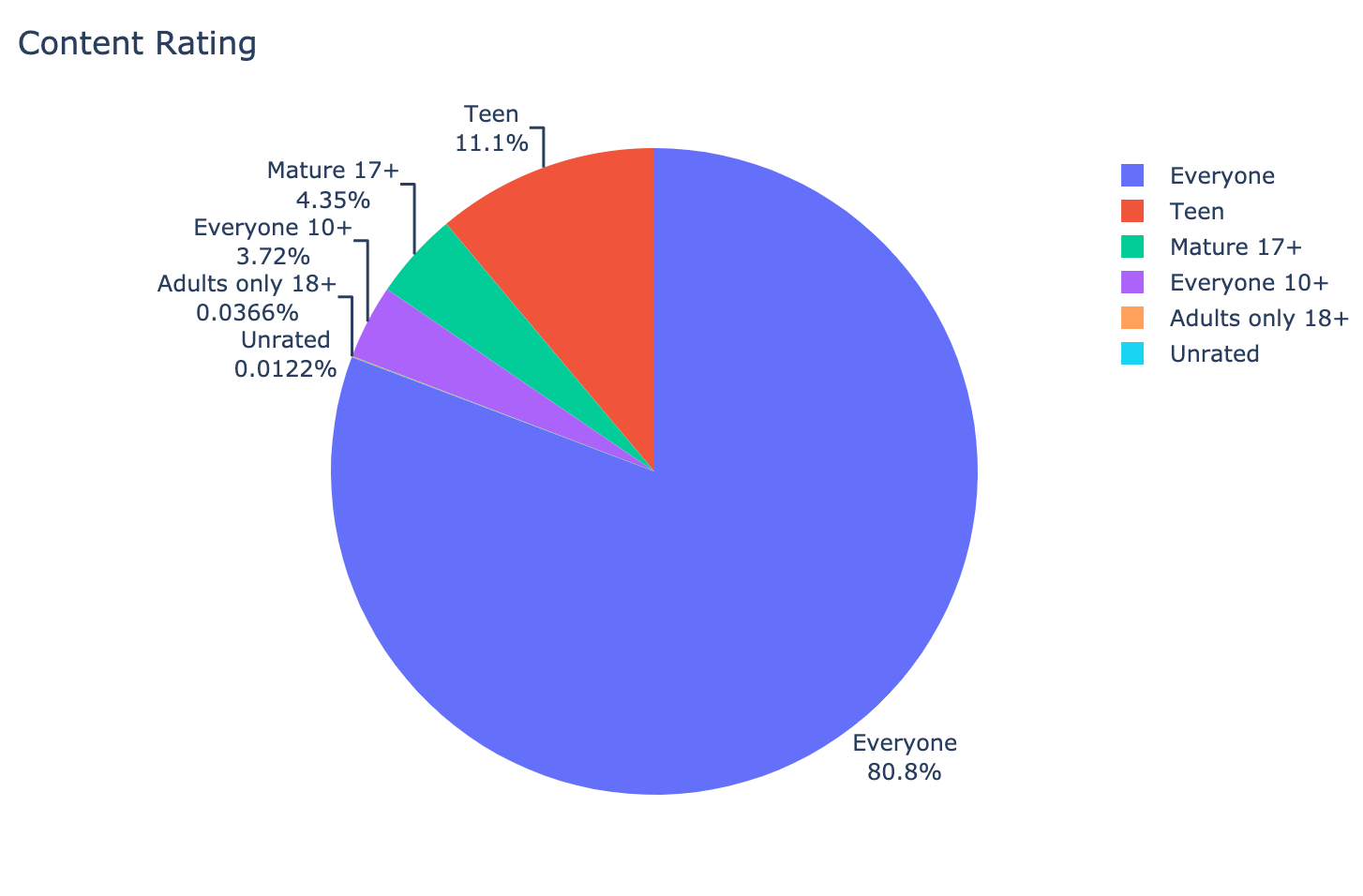
All Android apps have a content rating like “Everyone” or “Teen” or “Mature 17+”. Let’s take a look at the distribution of the content ratings in our dataset and see how to visualise it with plotly - a popular data visualisation library that you can use alongside or instead of Matplotlib.
First, we’ll count the number of occurrences of each rating with .value_counts()
ratings = df_apps_clean.Content_Rating.value_counts()
The first step in creating charts with plotly is to import plotly.express. This is the fastest way to create a beautiful graphic with a minimal amount of code in plotly.
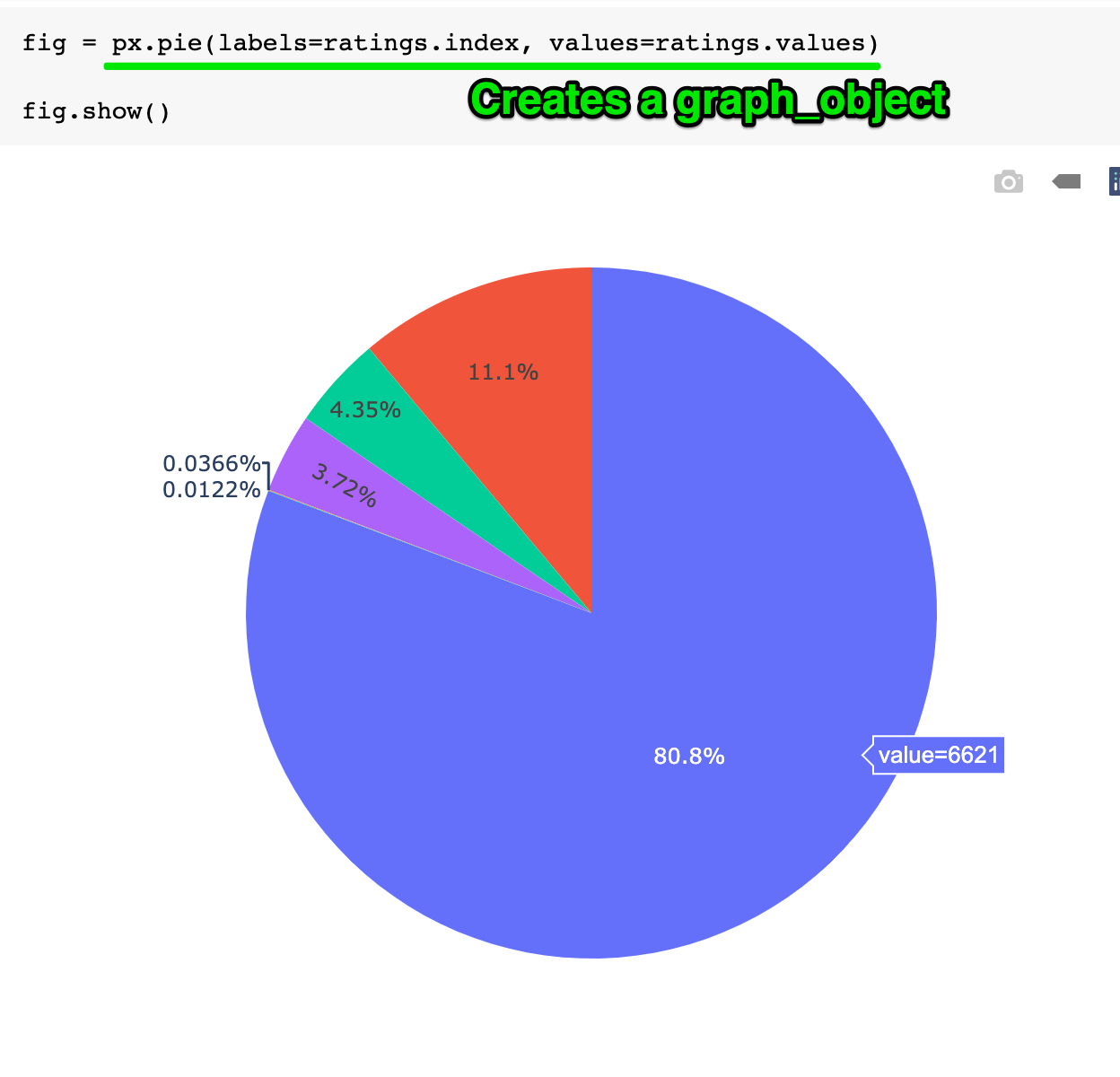
To create a pie chart we simply call px.pie() and then .show() the resulting figure. Plotly refers to all their figures, be they line charts, bar charts, or pie charts as graph_objects.
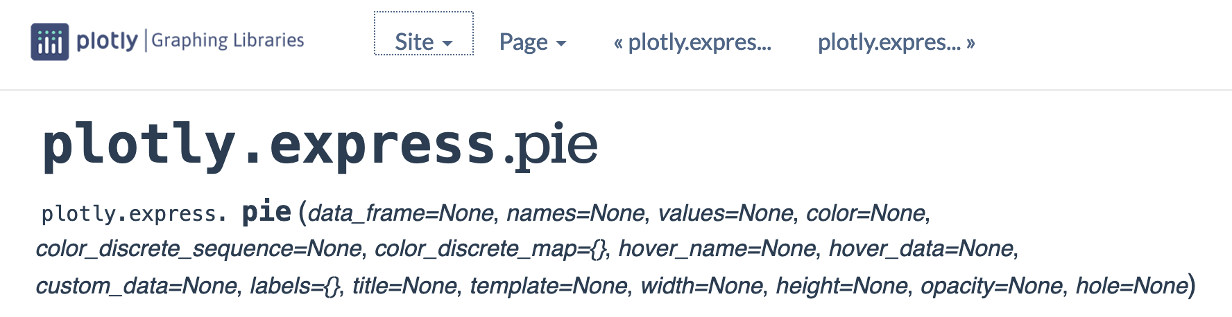
Let’s customise our pie chart. Looking at the .pie() documentation we see a number of parameters that we can set, like title or names.
If you’d like to configure other aspects of the chart, that you can’t see in the list of parameters, you can call a method called .update_traces(). In plotly lingo, “traces” refer to graphical marks on a figure. Think of “traces” as collections of attributes. Here we update the traces to change how the text is displayed.
fig = px.pie(labels=ratings.index,
values=ratings.values,
title="Content Rating",
names=ratings.index,
)
fig.update_traces(textposition='outside', textinfo='percent+label')

fig.show()
To create a donut 🍩 chart, we can simply add a value for the hole argument:
fig = px.pie(labels=ratings.index,
values=ratings.values,
title="Content Rating",
names=ratings.index,
hole=0.6,
)
fig.update_traces(textposition='inside', textfont_size=15, textinfo='percent')

fig.show()
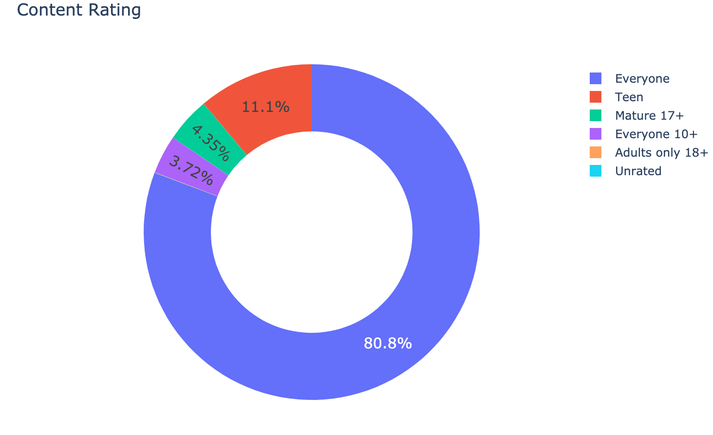
Yum! 😋